
How to Make a Prototype Look Polished With Minimal Art
A prototype does not need final art to look polished. Color, spacing, animation timing, and a few visual shortcuts can make a rough build feel intentional and clean.
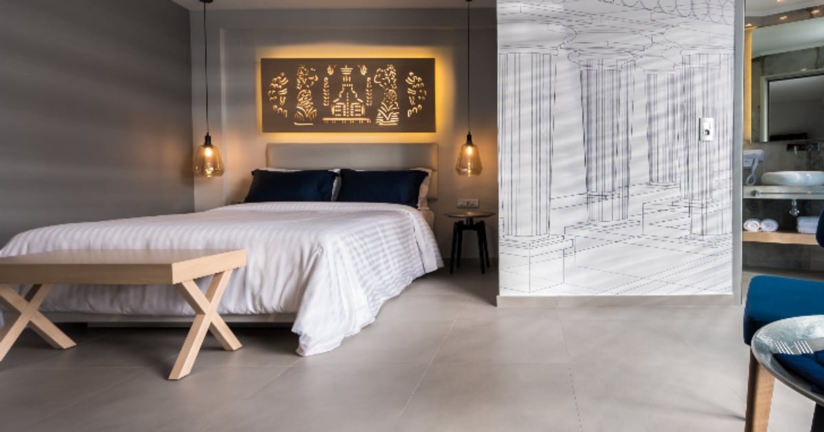
A polished prototype does not need custom art. It needs a consistent color palette, proper spacing, smooth animation timing, and a few visual shortcuts that signal intention rather than placeholder. The difference between a prototype that looks rough and one that looks clean is usually three to five hours of work applied in the right places.
Why this matters
Publishers and testers form impressions in seconds. A prototype that looks accidental gets less engagement, less useful feedback, and a worse first impression in a submission, regardless of whether the mechanic works.
Polish at the prototype stage is not about art quality. It is about visual consistency. A game made entirely of colored shapes can look intentional and clean if the colors, spacing, and motion are handled well.
The goal is to remove visual noise so the mechanic is the thing people notice, not the placeholder quality.
Color does most of the work
A limited, consistent color palette transforms a prototype more than any other single change.
Choose four colors. A background, a primary element color, a secondary element color, and an accent for interactive or important elements. Four is enough for any prototype.
Use high contrast between gameplay elements and background. The player needs to see the things they interact with instantly. Low contrast is the most common visual problem in prototypes.
Keep the palette throughout. Every element in the game should use one of the four colors. The moment a fifth color appears without purpose, the visual consistency breaks.
| Color role | Purpose | Example |
|---|---|---|
| Background | The canvas everything sits on | Dark blue or soft gray |
| Primary | The main gameplay element | Bright white or warm yellow |
| Secondary | Supporting elements, obstacles | Muted teal or cool gray |
| Accent | Score, interactive highlights, rewards | Vivid green or orange |
A prototype with four consistent colors looks more polished than one with twenty inconsistent ones.
Choose colors that work on mobile screens in both bright and dim lighting. Test the palette on a phone, not a monitor. Colors that look distinct on a large display can blur together on a small one.
Spacing and alignment
The second highest-impact change, and the one most often neglected in prototypes.
Align everything to a grid. UI elements, score displays, buttons, and game objects should sit on consistent positions. A slightly off-center element reads as a bug. A consistently placed element reads as a design choice.
Use consistent margins. Pick a base unit (8 pixels is common) and use multiples of it for all spacing. Elements 8, 16, or 24 pixels from edges rather than 7, 13, and 22.
Leave breathing room. Crowded screens look unfinished. White space between elements signals that somebody decided what goes where, per the layout principles in Mobile Input Handling.
Three specific checks that catch most spacing problems.
- Is the score or UI text the same distance from the top and sides?
- Are game elements evenly distributed or intentionally clustered?
- Is there space between interactive elements so they do not overlap visually?
Animation timing
Animation is where polish becomes feel, and small changes produce large effects.
Ease everything. Linear motion looks mechanical. An ease-in-out curve on movement, scaling, and fading makes everything feel smoother. The difference is a single line of code per animation.
Add a small delay between chained events. If three things happen in sequence, stagger them by 50 to 100 milliseconds. Simultaneous events look like a bug. Staggered events look choreographed.
Make hits and collections feel snappy. A quick scale-up followed by a settle-back on collection, a brief flash on hit, a short screen shake on impact. These are the juice techniques from Why Juice Sells, and they take minutes to add.
Keep animations short. 200 to 400 milliseconds for most transitions. Longer animations feel slow on mobile, and players will tap through them.
Visual shortcuts that signal polish
Five small additions that make a prototype look intentional.
- A background gradient instead of a flat color. A subtle shift from dark to slightly lighter draws the eye toward the gameplay area and costs nothing.
- Rounded corners on UI elements. Squares look like placeholders. Rounded rectangles look like design choices. One property change.
- Drop shadows or outlines on interactive elements. Separates them from the background and adds depth without art. A 2-pixel shadow is enough.
- A simple particle burst on events. When the player scores, collects, or hits something, a small burst of particles celebrates the moment. A basic particle system with ten particles and a 300-millisecond lifetime is enough.
- Consistent text styling. One font, two sizes (one for gameplay, one for UI), and the accent color for important numbers. Three rules that make all text look deliberate.
None of these require an artist. All of them take minutes to implement and significantly change the impression the prototype makes.
What not to do
Three common mistakes when polishing a prototype.
Do not add custom art to placeholder geometry. If the mechanic might not pass the test, custom art is wasted. Polish the geometry itself with color and animation instead.
Do not spend time on screens the publisher will not see. Menu screens, settings, and credits are invisible in a prototype test. Polish the gameplay screen and nothing else.
Do not add effects that obscure the mechanic. Particles, screen shakes, and flashes should enhance clarity, not reduce it. If an effect makes it harder to see what is happening, remove it regardless of how good it looks.
The goal of prototype polish is not beauty. It is clarity plus intention. Everything should make the mechanic more visible, not less.
A polish checklist
Run through this in order. Each step takes 15 to 30 minutes.
- Set the four-color palette and apply it to every element.
- Align all UI elements to a grid with consistent margins.
- Add ease curves to all movement and transitions.
- Add a scale-and-settle animation to collections and scores.
- Add a particle burst to the primary gameplay event.
- Replace flat backgrounds with a subtle gradient.
- Round the corners on UI elements and add thin shadows.
- Set one font at two sizes for all text.
Total time: three to five hours. The prototype will look like a design choice rather than a work in progress, and that difference changes how publishers and testers respond to it.
What we would do
Set the color palette before building anything else. Choosing four colors at the start takes five minutes and prevents the visual drift that makes prototypes look inconsistent.
Then apply the polish checklist above after the mechanic works but before any external test. The three to five hours spent here improve the quality of the feedback you receive, which means the information from the test is more reliable.
Skip everything that is not on the gameplay screen. The publisher will never see your menu, and the time is better spent on the thing they will actually evaluate.
The short version
- A consistent four-color palette does more for polish than custom art.
- Align everything to a grid with consistent spacing and margins.
- Ease all animations and stagger chained events by 50 to 100 milliseconds.
- Add a particle burst, rounded corners, drop shadows, and a background gradient.
- Polish only the gameplay screen. Skip menus, settings, and credits.
- The full polish pass takes three to five hours and changes how the prototype is received.
Run through the checklist on your current prototype this week. If you want a prototype that looks polished from the first build, tell us the concept.
Related reading: Why Juice Sells, Mobile Input Handling, and What Voodoo Actually Looks For.
Got a game idea? We build it.
You bring the concept. We design, build, test and launch it, and you own 100% of the finished game.
Share Your Game Idea →Keep reading
 Design
Building a Daily Reward System in Under 500 Lines
A daily reward system is one of the simplest retention tools to build and one of the easiest to get wrong. Here is the…
 Design
How to Add Depth to a Hyper-Casual Prototype
Depth in a hyper-casual game means giving players a reason to return without slowing down the thing that made them inst…
 Design
Why Your Tutorial Loses Players in the First Minute
Most tutorials fail because they teach before the player has a reason to care. The fix is almost always to let the play…